Corporate identity
namuk
Role: Art Director
A young Swiss brand making outdoor clothing for children. The owl logo existed, and little else. The image had never really been built.
Starting point
The clothes are technical and expensive. The image had to make that quality visible, and it had to work for two audiences at once: the children who wear the clothes and the parents who pay for them.
The challenge
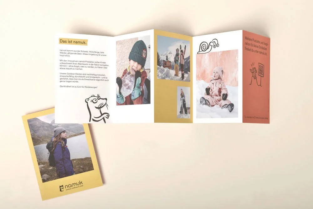
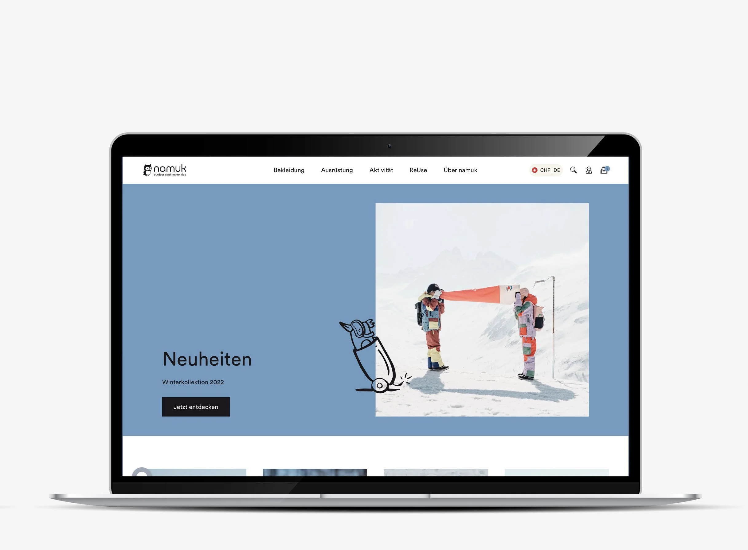
I built the identity around quality, in the Swiss sense of the word: a typeface drawn in Switzerland, minimal typography, restraint. Then the namukers, a family of hand-drawn animals that soften all that rigour and run playfully through everything, from the hangtags and the lining labels to the cards children can cut out. The same drawn language runs through the collections, so the two halves hold together.
I redesigned the wordmark, and the owl too, though that one was never used. Everything else I developed and produced myself: colour concept, typography, icons, illustration, photographic direction, packaging, print and point of sale. For the website I ran the project with an external agency. And for each collection I built the seasonal theme and drew the assets that carried it: allover prints, artworks, trims and labels.
The work
I initiated the namuk ReUse platform. It now accounts for around 20% of the company's annual turnover. I was responsible for the production of all print assets, in Switzerland and in the US. I also contributed to the collection strategy.
Behind the scenes






Icons selection


